Santa uses location data and so should you
Dr. Maria KlieschDr. Philipp Thomann
What do Santa Claus and data scientists have in common? … They both get much better at their jobs when they know how to handle location data. The difference? Santa Claus has been using geospatial data to locate houses around the (Santa believing) world for several hundred years, while data scientists have only recently started using it.
Geospatial Data Science is the discipline of distilling insights from any source of data that comes with a spatial component. As of 2012, it is estimated that 60–80% of all information is geospatially referenced, a number that has likely increased since then. Yet few companies are aware of — let alone exploit — the full potential of geospatial data. By understanding why things happen where, companies can predict and influence where things will happen next and thereby increase the effectiveness of marketing and advertising campaigns, optimize supply chains and logistics, improve customer experience and make more informed decisions about where to invest in their own innovations, to name just a few examples.
In this blog post, we give you a brief introduction to geospatial data science using a Christmas-themed data story. We show you the types of data you are likely to encounter, introduce you to state-of-the-art geospatial tools in Python, and provide insightful visualizations in the process. The best part is that in order to get started with geospatial data and add value to your business, you do not need to already have a wealth of location data. We introduce you to a handful of extremely valuable open government datasets in Switzerland that you can use to enrich your existing data. To run the code yourself, you can use the Jupyter Notebook e.g. on Google Colab:
Use case: Can you hear Santa?
Christmas is a time of quiet and reflection. This is ideal for Santa Claus, because children can hear his sleigh — equipped with dozens of jingle bells — from afar. According to an estimate, jingle bells can be up to 77dB loud, louder than your vacuum cleaner. But is that loud enough for every child to hear Santa? In Switzerland, we have trains, cars and airplanes, none of which slow down for a quiet Christmas eve. Could their noise drown out the sound of Santa’s jingle bells? Let us find out and count the number of children that may not be able to hear Santa’s arrival due to the ambient noise of the neighborhood they live in.
To that end, we need to know how many children live where in Switzerland, and how noisy specific locations of Switzerland are. Luckily, the following open government datasets are readily available for our analysis:
- Population and Households Statistics (provided by the Federal Statistical Office)
- Street noise data (provided by the Federal Office for the Environment)
- Train noise data (provided by the Federal Office for the Environment)
- Aviation noise (provided by the Federal Office of Civil Aviation)
Datasets and types explained
Population Statistics
The Population and Households Statistics are part of the surveys conducted within the framework of the Fedral population census. The statistics provides information regarding population size and composition of the permanent resident population at the end of a year as well as population change during the same year. People living in Switzerland are counted, among others, by age, gender, nationality, household size or duration of residency.
The dataset comes as a CSV and has “RELI” as its primary key. Relis are 100x100m squares, which are spread across Switzerland and make up the “pixels” of the map of Switzerland.
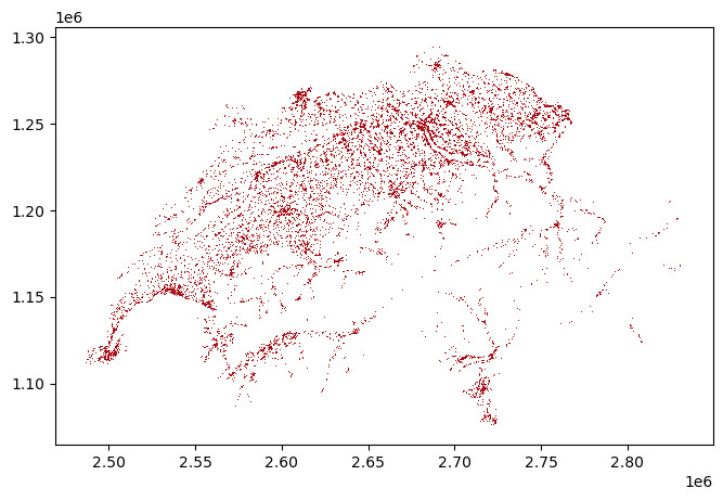
pop_stats_gdf.plot(figsize=(40, 5), facecolor='#ab121a')
plt.show()
We used this dataset to count the number of children in specific areas by simply loading and summarizing the dataframe with Pandas. We found that at least 1,060,000 children live in Switzerland as of 2021. For this analysis, we did not need the data to be in a spatially-referenced format yet, but once we performed spatial operations on the relis, the data had to be transformed into a GeoPandas dataframe (i.e. GeoDataFrame), as we will see later.
Noise data I: Rasters
The Swiss Government provides three datasets on noise levels: one on street noise, one on train noise and another one on aviation noise. The first two come in a similar format, that is, a raster in a geoTIFF-file. A geoTIFF is an actual image file with georeferencing information, such as the coordinate system, embedded inside of it. We discuss train and street noise separately from the aviation noise, as the latter comes as a shape file rather than a raster.
The street and train noise data are based on areawide model calculations, and estimate the noise level across the entire road and rail networks in Switzerland. Raster data such as this can be read, for example, using the <strong>rasterio</strong> module and visualized with the respective rasterio plotting functions.
# this is how the row/col coordinates are extracted from x/y coordinates
row_min, col_min = rasterio.transform\
    .rowcol(streets_raw.transform, x_min, y_min)
row_max, col_max = rasterio.transform\
    .rowcol(streets_raw.transform, x_max, y_max)
fig, ax = plt.subplots(figsize=(30, 5))
# for showing a colorbar next to the plot
image_hidden = ax.imshow(streets_data[row_max:row_min, col_min:col_max],
    cmap='inferno')
image = plt.imshow(streets_data[row_max:row_min, col_min:col_max],
    cmap='inferno')
fig.colorbar(image_hidden, ax=ax)
fig.show()

Noise data II: Shapefiles
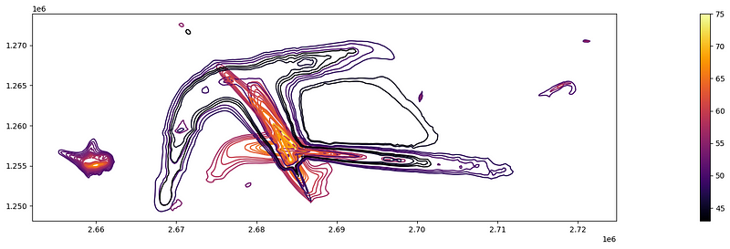
The third noise dataset represents aviation noise, that is, the “Kataster der belasteten Standorte im Bereich der zivilen Flugplätze”. The dataset includes the average aviation noise pollution curves calculated on actual and predicted flight paths and common noise emissions of different aircraft types.
The original file, which comes with the eXtended Triton Format (XTF), can be tricky to load with common GIS packages, hence we recommend transforming it into an Esri Shapefile (SHP) using a converter tool see Geoconverter, for example.
The resulting shapefile contains multiple layers, out of which the “ExposureCurve” layer contains the actual noise curves. These are represented as contour lines similar to those of an elevation profile. Each contour line is associated with a specific noise level in dB, so that louder polygons are stacked on top of quieter ones:
flights_plt = flights_raw.cx[x_min:x_max, y_min:y_max]
flights_plt.plot(column='Level_dB',
                 legend=True,
                 figsize=(40,5),
                 cmap='inferno')
plt.show()
To recapitulate, the datasets we are dealing with for this analysis include a normal Pandas dataframe as well as raster and shape data. Their resolution ranges from 10x10m (street and train noise), over 100x100m (population statistics) to varying polygon shapes (aviation noise). Let us now find out how to combine these shapes to determine the number of children living in noisy neighborhoods.
Joining the data
Normally, if you have to combine rows from two or more tables, you do so based on at least one common field between them. With spatial dataframes, this shared field does not necessarily exist, but you can combine their rows based on the spatial relationship between their geometries, hence “spatial joins”. For example, you can join two rows if their geometries intersect, overlap or touch or if one of them contains the other.
When joining two spatial tables, you need to bear in mind that resolution of your data may change. In our case, for instance, the street noise data is resolved to 10x10m, while the population statistics have a resolution of 100x100m. It is not possible to determine how many people live in the lower left 10x10m corner of the reli, so we cannot upsample the population data. Instead, the higher resolution data (street noise) must be summarized over a larger area, e.g. with maximum or average values per reli.
In our use case, we first need to convert a normal Pandas dataframe (population statistics) to GeoDataFrame in order to combine with raster data (street or train noise) and then join the resulting table with shape data (aviation noise).
To merge all of these data into one dataframe, we implemented the following workflow:
- Transform relis into geometries. This adds a geometry column to the population table, which allows us to use the population statistics in spatial joins. To transform relis into geometries, you can use the
shapelymodule to create a box geometry starting from the left lower reli coordinate, which is given in the dataset through the 'e_lv95' and 'n_lv95' coordinates, and add 100 to the Easting and Northing coordinates, respectively, to define the remaining three corners. The resulting box is now a polygon vector. - Join vector and raster data. To merge population statistics and raster data (street and train noise) from an image, first use an affine transform to map the raster pixels (row, col) into geographic/projects (x,y) coordinates. This can be achieved by rasterio’s
transform-method. The resulting tuple can then be used withzonal_stats(), which is rasterio's method to join raster data and vector geometries, i.e. our street/train noise data and the reli geometries of the population stats. The resulting dataframe allows us to count the number of children that live in relis where the street/train noise level is above 77dB. - Join the GeoDataFrames. The final dataset to join is the aviation data, which already comes with a geometry column. Again, our goal is to count children per reli, so our target resolution is reli, too. Hence, the flight noise data is left-joined to the population statistics using an intersect operation. This means that whenever the geometry of a flight noise polygon intersects with a reli, the respective noise level is joined to the row of the respective reli. This can be achieved with GeoPandas’
sjoin-method, in which you simply define the two tables to join, the type of join and the join operation.
m = folium.Map(location=[47.36667, 8.55], zoom_start=12)
# Convert LV95 to WGS84
noisy_relis_street = pop_street_stats_gdf[
    pop_street_stats_gdf['street_noise'] >= 77
].to_crs(epsg=4326)
# Plot each row's noise level as a dot
for _, r in noisy_relis_street.iterrows():
    geo_j = gpd.GeoSeries(r['geometry']).to_json()
    geo_j = folium.GeoJson(data=geo_j,
                           style_function=lambda x: {'color': '#ab121a'})
    geo_j.add_to(m)
m
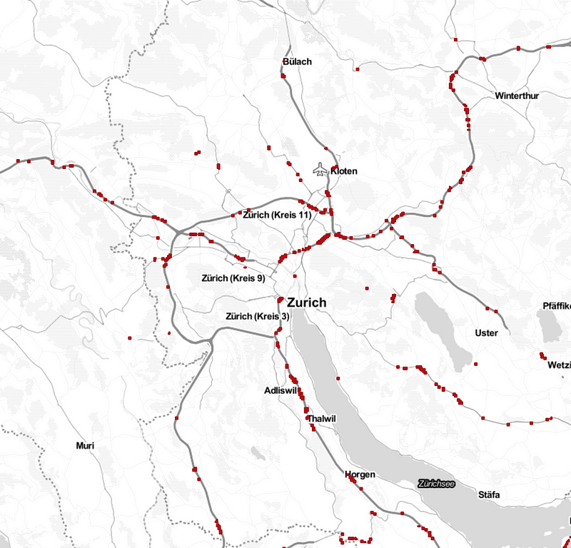
Once we have joined population statistics and noise data, we can determine the loudest source of noise per reli and count the number of children that live in relis (i.e. neighborhoods) with noise levels above 77dB.
The bittersweet truth
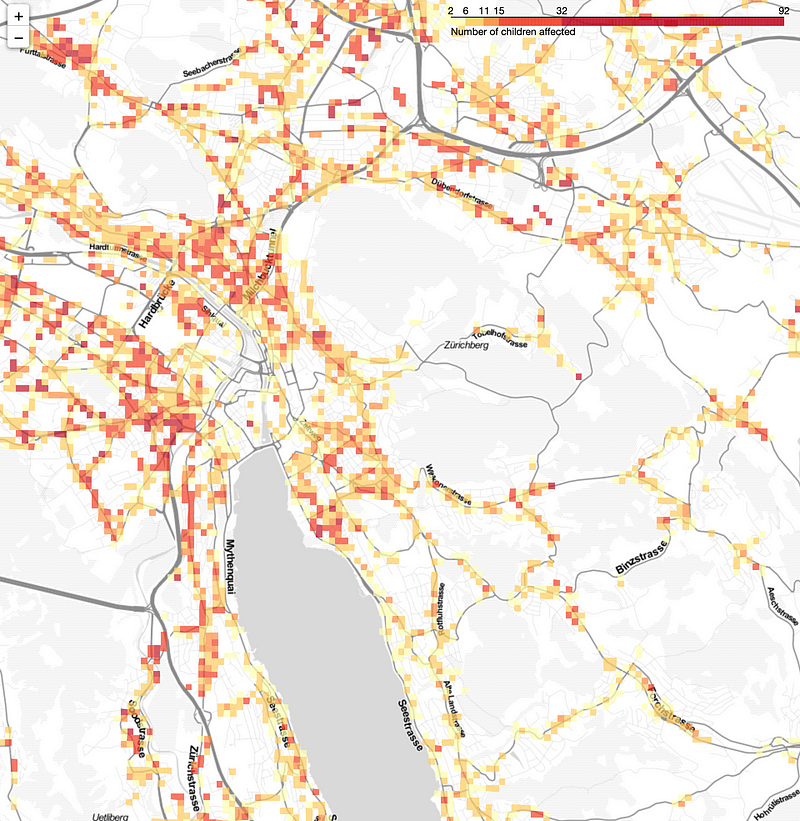
So are Santa’s jingle bells loud enough to be heard by every child in Switzerland? Unfortunately not. 12,137 children live in neighborhoods where either trains, cars or planes are louder than 77dB. Even worse, 77dB is far above the alarm value that the Federal Office for the Environment has formulated for residential areas. The actual immision limit value that signals a potentially health-damaging level of noise is 60dB. If run using this lower threshold, the number of children affected by noise pollution even increases to 512,892.
Not so Silent Night after all.
m = folium.Map(location=[47.36667, 8.55], zoom_start=12)
plt_df = noise_gdf[((noise_gdf['street_noise'] >= 60)
                          | (noise_gdf['flight_noise'] >= 60)
                          | (noise_gdf['train_noise']>=60))
                  & (noise_gdf['children'] >0)
                  & (noise_gdf['e_lv95'] > 2660000)
                  & (noise_gdf['e_lv95'] < 2710000)
                  & (noise_gdf['n_lv95'] > 1230000)
                  & (noise_gdf['n_lv95'] < 1270000)].to_crs(epsg=4326)
custom_scale = (plt_df['children'].quantile((0,0.5,0.8,0.9,0.99, 1))).tolist()
folium.Choropleth(
    geo_data=plt_df,
    name = 'Children affected by noise pollution',
    data = plt_df,
    columns = ['reli', 'children'],
    key_on = 'feature.properties.reli',
    threshold_scale=custom_scale,
    fill_color='YlOrRd',
    line_color='YlOrRd',
    fill_opacity=0.7,
    line_opacity=0.7,
    legend_name='Number of children affected',
    smooth_factor=0
).add_to(m)
m
Conclusion
Working with geospatial data can provide valuable insights into data that are referenced to a specific location. In this blog post, we analyzed noise levels in Switzerland and the number of citizens affected by noise pollution, but use cases are virtually unlimited and can be identified for any sector.
Moreover, we hope to have convinced you that it is quite straightforward to get started working with geospatial data using Python. Although joining spatial datasets requires some additional transformation steps and considerations about the geospactial type of join, it still shares many similarity with typical dataframe joins.
The datasets we have used for this analysis are all open-source and are far from exhaustive. Maybe noise data are not that relevant for you, but what about a registry of all buildings in Switzerland, natural hazards or employees per sector and neighborhood? These and more datasets can be found on data.geo.admin.ch and geodienste.ch.